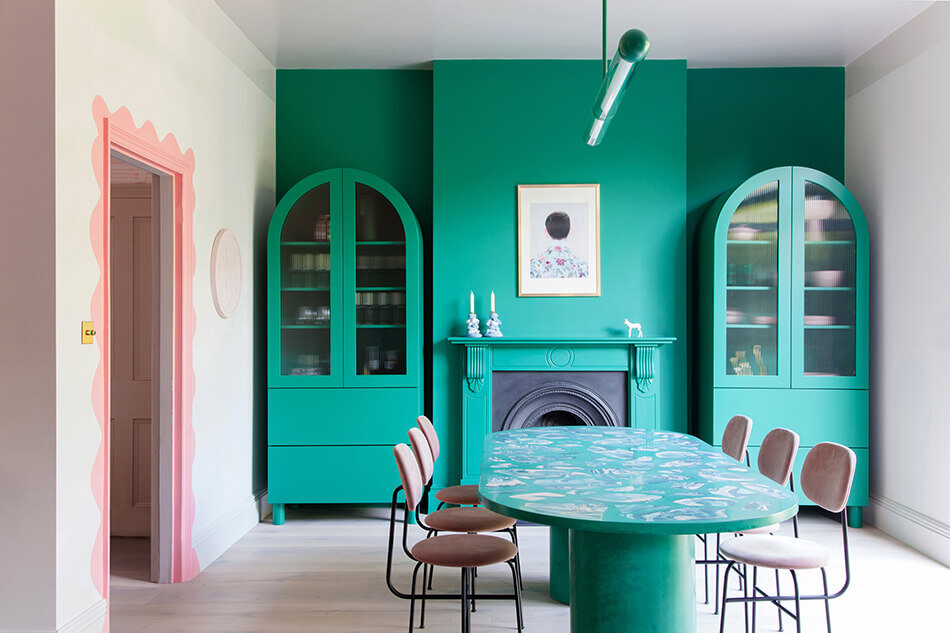
Inspo: Modern Memphis
When I first heard the thematic design defined as “Memphis Design Style” I thought about blue, barbecue & creole, and the ducks at the Peabody. Nope! It’s much more about the 1980’s The Max diner from the hit show Saved by the Bell. A.C. Slater eat your heart out.
The Memphis Group was started in 1980 by an architecture and design group in Italy headed by Ettore Sottsass (famed for the Mayer-Schwarz Gallery in Beverly Hills, California.) It’s name comes from the first meeting where Bob Dylan’s song "Stuck inside of Mobile with the Memphis blues again" was playing in the background.
How’s that for woo woo?
One design firm that is absolutely crushing Modern Memphis style is 2LG Studio. Their work is slotted in below.
Key Style Elements
1. Geometric shapes.
Chunky half-circles and curved lines arranged in more regimented positions, preferably with a dotted background.
2. Bold colour pallets.
Mixing of neon gradients, ice-cream pastels or pared-back earthy colours for a fresh take on the style.
3. Grainy textures.
Adds just the right amount of vintage charm to a design.
4. Simple and big
Most of Memphis Style can look super busy, but by exaggerating proportions and colour blocking with a modern mix, the style is anything but boring!
Designers alike either love or hate Memphis style. Some love the playfullness of shapes while others they think the style is tasteless.
Do you agree? Comment below!


