Glen Park Kitchen Renovation
A geometric electric kitchen renovation design project within Kensington-Cedar Cottage in the Glen Park neighbourhood of East Vancouver, B.C.
City City of Vancouver
Year 2023
Team Fifth Element Construction
Sector Kitchen and Bath Design
Photographer Victoria Jazmin Photography

Design Statement
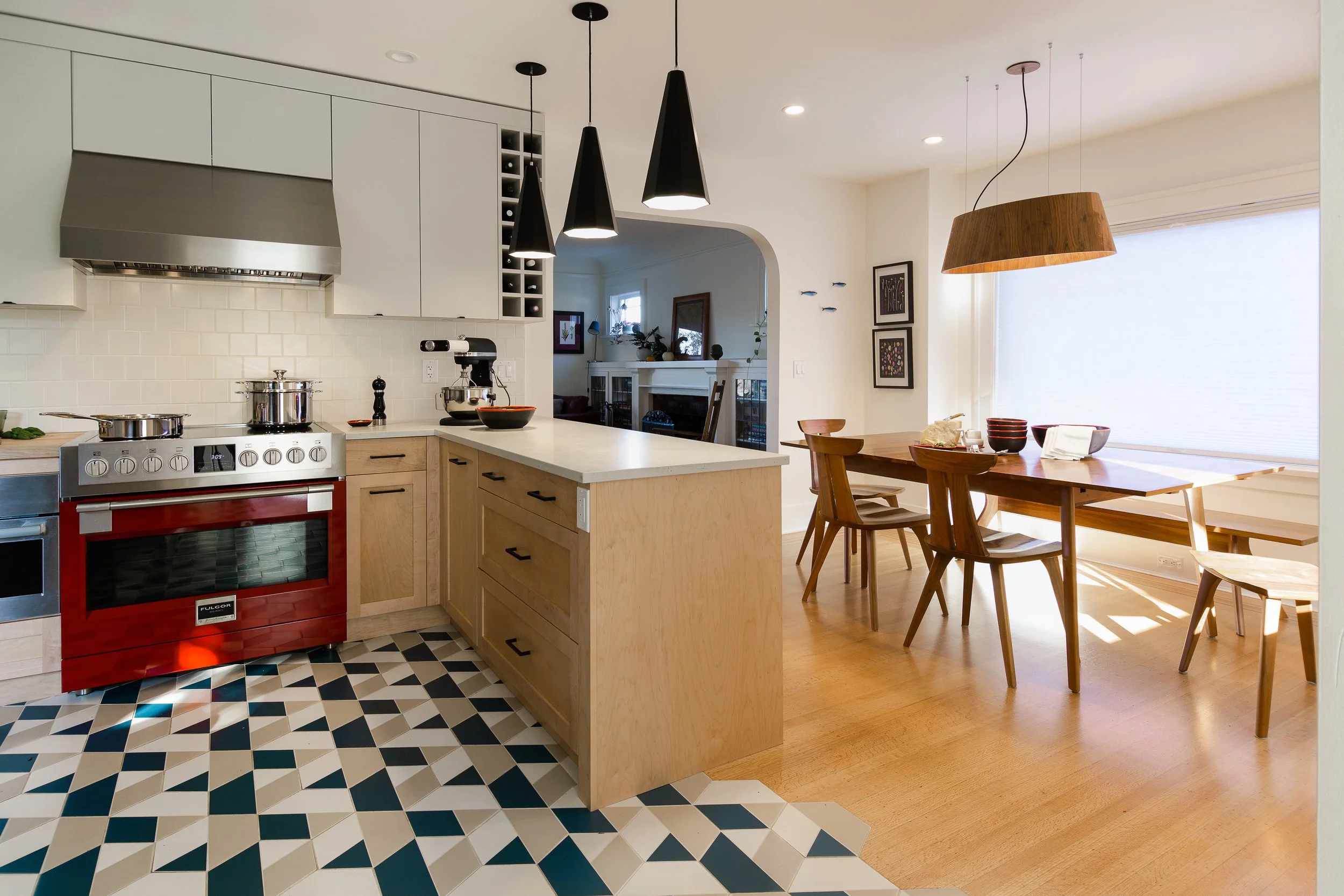
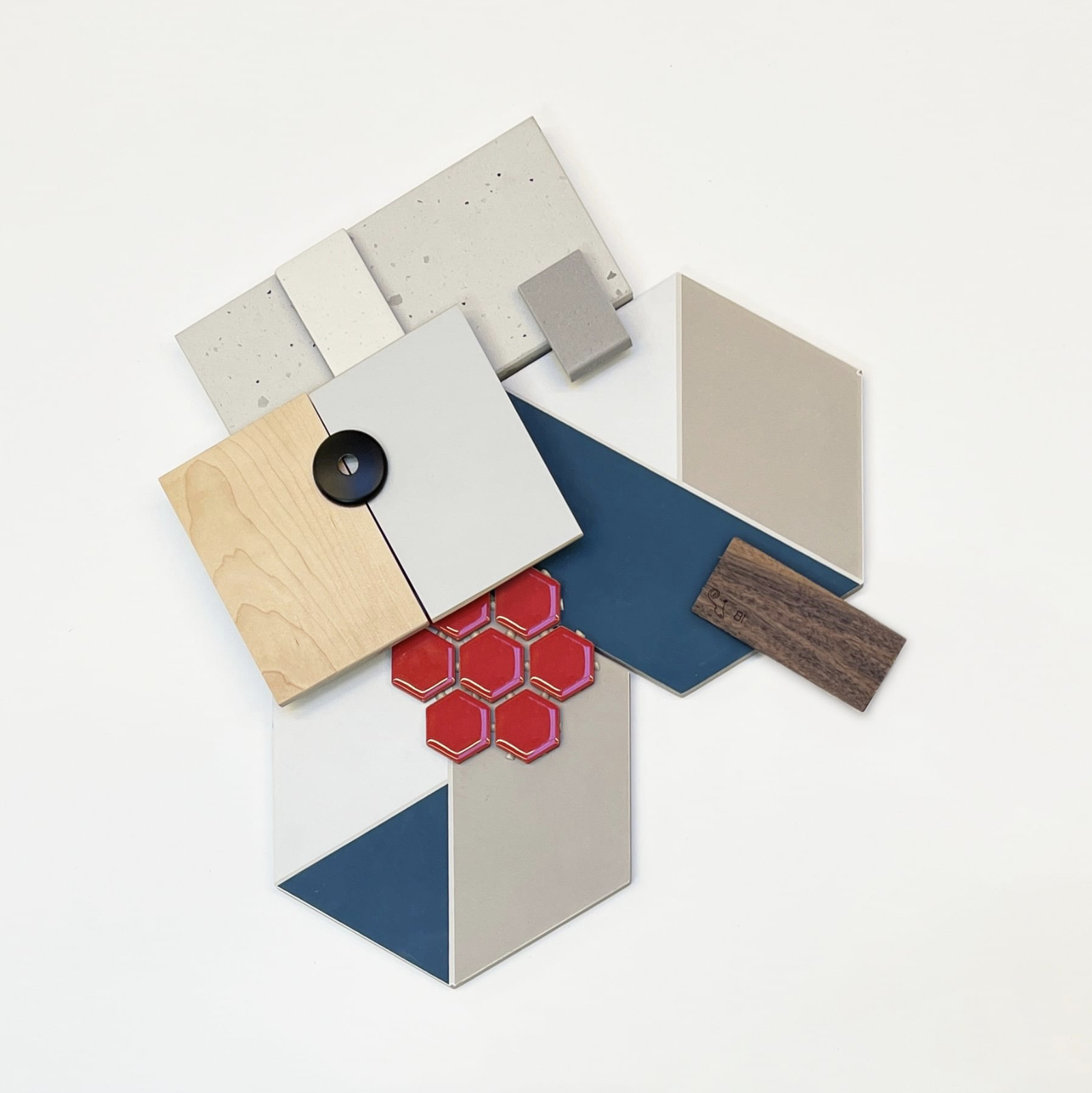
Geometric Eclectic is a project that came to us from our good independent contractor partners. It is the kitchen design and renovation of a characteristic cottage home in the heart of East Vancouver, near Glen Park. We added graphic elements like hexagonal tiles, natural maple kitchen cabinets, and an eclectic floor tile with a pop of colour.
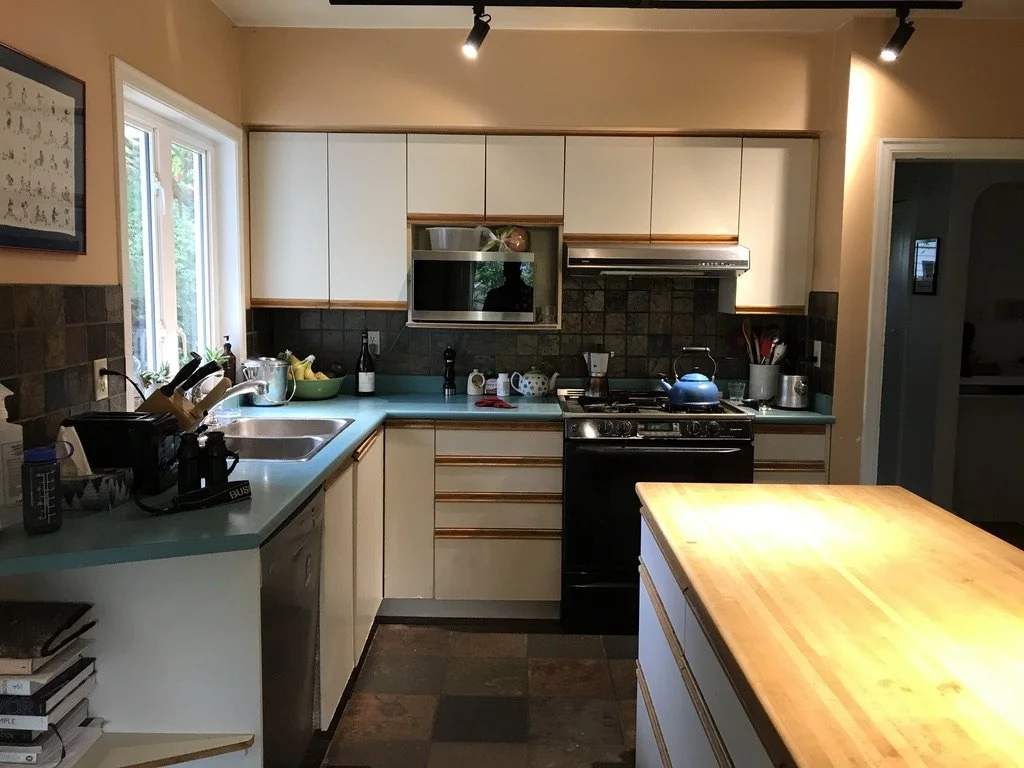
Our client was seeking a kitchen with increased storage, improved activity zones, a coffee point, and a specialty area for celiac cooking. With layers of renovations, the last one in the 1980’s, the connection between adjoining spaces and natural views were disrupted. The idea was two opposing L-shapes, a pop of colour, and a “geometric eclectic” style that mimicked their existing graphic art collection.
Many kitchen renovation design projects propose design challenges that we cannot see in advance. There is the impact of changes to the existing building envelope, windows and natural daylight, kitchen exhaust systems, circulation through the kitchen, and its connection to other living spaces. During the planning process, we reviewed twelve different layout and arrangement options for this small kitchen so that it could address the clients wishlist goals and objectives — landing on an arrangement called a “Broken G-Shape”.
We removed the door to the basement and opted for a direct flow down the stairs, which was actually impeded by a surprise on-site during demolition. We also removed the old partition and header dividing the dining room, coved ceiling in the dining room, french doors separating the living room, and entry closet so that we could improve connection, volume, storage, and circulation. We replaced all the windows and exterior doors, changing a couple of swing directions, but opted to integrate the original cottage character and modernize the aesthetic.
With an affinity for warmth and red, the Venetian red range, the original Douglas fir floors in the dining room, and the client's artwork was the jumping-off point for the style. A pop of red hexagonal tiles draw and focus your eye in the open space, balancing out the strong geometric flooring pattern, all calmed down by natural maple base cabinets and painted soft-grey wall cabinets.













![What is "Democratic Design"? [New]](https://images.squarespace-cdn.com/content/v1/56e37bfdb09f956469f74f05/1486337200150-SF032TA2KEP5V4ZO7Q30/kaboompics.com_Wooden%2Bmannequin%2Bas%2Ba%2Bpuppet.jpg)
It’s often difficult for most people to identify their design style.